Here is a story about two cornfields “just down the road from each other.”
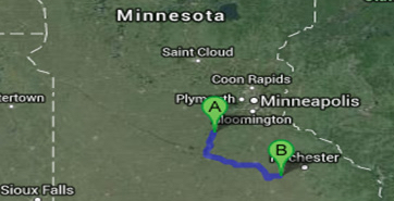
Once upon a time, there were two fields of corn. One field was located near Henderson, MN (“A”) and the other in Hayfield, MN (“B”), a little less than 100 miles away, which isn’t very far by Midwestern standards.
Both fields were planted within a day of each other during the same week in early June. Both were planted with the same corn variety that had a relative maturity of 100 days or about 2,470 Growing Degree Days (GDDs) to Black Layer. Assuming everything else was the same in these two fields – same fertility and crop protection programs – one would expect similar results, at least as far as crop maturity is concerned. Right? Not necessarily. Just ask Mother Nature.
As it turned out, the crop in Henderson reached full maturity in late September while the crop in Hayfield, less than 100 miles to the south, never got much over 2,200 GDDs and failed to achieve its full potential.
The truth was in the data
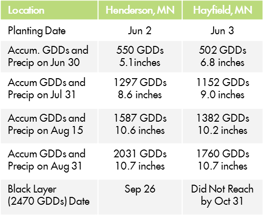
Before the sponsor took the cooperator to task, Planalytics® was consulted. Planalytics CropPlannerSM application tracks daily temperature and precipitation values from across North America. Weather station data is interpolated to the field level. The table on the right contains a summary of daily minimum and maximum temperatures converted to GDDs (base 50°F/cap 86°F) and precipitation amounts for the two southern Minnesota locations.
Hayfield recorded almost 7 inches of rainfall during the first month after planting, thee inches more than normal. Henderson, on the other hand, had only 5 inches of rain in June, slightly more than normal. But it was the deficits in temperature – partly brought on by the excess precipitation – that held back Hayfield’s crop from reaching full potential.
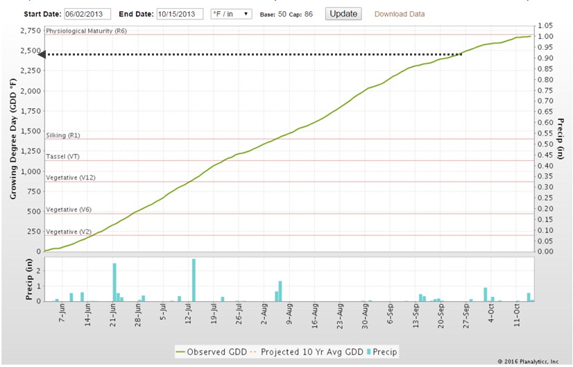
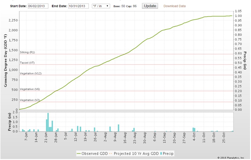
Planalytics CropPlanner application graphically plots accumulated Growing Degree Days and precipitation. The green lines in the charts below represent actual GDD accumulation from the planting (start) date. The blue vertical bars below the graph indicate daily precipitation amounts. The dotted line on the Henderson chart indicates when 2470 GDDs, or physiological maturity, would have occurred, around September 26.
Corn Planting Date: June 2
Corn Planting Date: June 3
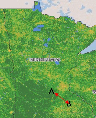
Normalized Difference Vegetation Index (NDVI)
Current Vegetation Greenness
Note the deep green shades of Greenness, or high biomass, near Henderson (A) compared with the yellowish-green shades at Hayfiend (B.) High biomass generally translates to a more advanced stage of the crop. Lower biomass shades can be indicative of delayed crops or areas of stress.
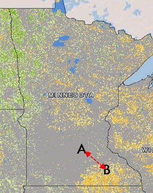
Normalized Difference Vegetation Index (NDVI) Compared to Normal
Depicted on the left is the difference in NDVI between the August 12th measurement and the average of all years of data. At the Henderson plot (A) there is no green or yellow value difference which means conditions are fairly normal. At point B, however, we see Hayfield with widespread yellow-orange shades; that translates to biomass values that are considerably less than normal.
Getting back to our story. . .
The field plot sponsor still found it hard to believe that there could be that big a difference between the two locations, until we showed him our satellite “Greenness” pictures. “Greenness” is another term for NDVI – which is an abbreviation for the Normalized Differential Vegetation Index, a measurement of plant biomass. Together with our partners at TerraMetrics Agriculture, Inc. and the University of Kansas (KARS), Planalytics has compiled over 27 years of NDVI data that showed — quite clearly —that there was a distinction in plant vigor between the two locations during the critical August grain fill period.
Looking to understand how weather is really affecting your business?